

A Theatrical Hour
At MoonPay, design labs were meant to be where the team thought together. They weren't. Designers presented because they felt they had to, not because they had hard questions. "Does this make sense? Is there anything you'd change?" Generalised questions invited generalised answers. Feedback stayed surface-level — aesthetics, wording, flow. The easy problems consumed all the oxygen. The strategic, ambiguous, subjective ones — the problems that actually need debate — never made it on the agenda. A theatrical hour. Show and tell dressed up as collaboration.
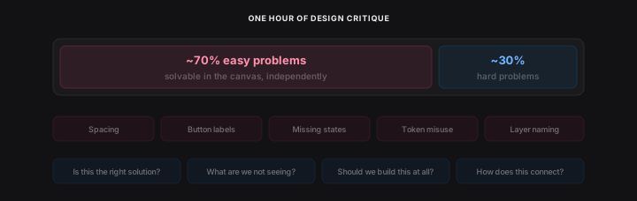
The problem wasn't the labs. Design is mostly solitary work. One designer, one canvas, no one to push back. When every team needs design at once, senior designers become the bottleneck for everyone else's thinking — and they can't be in every conversation. The easy problems get over-polished between labs. The hard ones fester.
People were already trying to fix this themselves — screenshotting designs, sending them to ChatGPT. Everyone doing it independently, with different prompts, different standards, none of it grounded in shared knowledge.
The question wasn't how do we fix design labs. It was how do we raise the thinking floor for every designer, so the conversations that do happen start at a higher altitude.
Pair Design for Everyone
Claude Code gave every engineer a senior pair programmer. I wanted every designer to have the equivalent — a principal-level thinking partner, not for faster output, but for sharper reasoning.
I'd already built a custom GPT grounded in UX principles and content rules. It changed how I made decisions — grounding gut feelings in real principles, backed by science. But it was fractured: screenshots pasted into ChatGPT, no awareness of the canvas or the design system. It could be so much more in the tool.
The concept crystallised into something simple: Claude is a principal-level engineer sitting with you in your codebase. This is a principal-level designer sitting with you in your canvas.

The goal was clear: not a linter, not an auditor — a thinking partner that asks the question you hadn't thought to ask, names the principle you were feeling but couldn't articulate, and pushes back when your rationale is thin.
I built the full V1 in a single session — fourteen source files, Anthropic's API with vision and tool use, a chat interface themed to Figma's design language. It produced feedback grounded in real principles. But it wasn't conversational yet, and what happened next is the part I almost got completely wrong.
But, I Built a Linter by Accident
I started building intelligence. The copilot would provide feedback — "this hidden layer should be a boolean prop" — and then offer to fix it. Rename layers, toggle visibility, add boolean properties, restructure component sets. Feedback and action in one flow. The feedback part was working. The action part was hard — so many edge cases, so many Figma API gotchas. Every one I solved felt like progress.

But I was going down rabbit holes. So many things the plugin could do, so many edge cases to handle. The bigger problem wasn't the engineering. It was the product.
Then I stopped and looked at what I'd actually built: a linter. And a linter is not going to help you become a better designer. It's going to do the work for you.
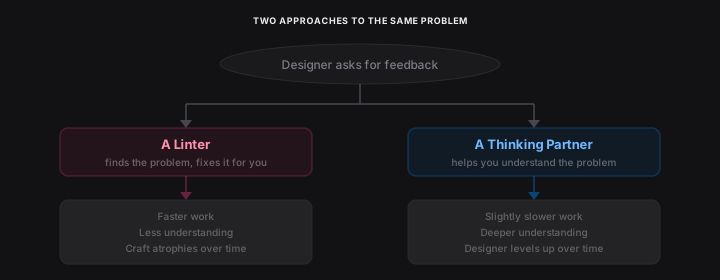
The muscle memory of setting up variants, structuring boolean props, connecting variables, building complex auto-layout components — these things take time and require thought. Passing it off to a linter makes designers technically faster, but less talented at using the tool. They stop learning. They stop understanding why the component is structured that way.
This is happening across the AI tooling wave. Claude Code writes beautiful code for engineers who can't write code well. Lovable, Claude Design, and the rest do the same thing for designers — they produce plausible output from minimal input. Used well, they're for iteration, optionality, unsticking. Used at face value, they hand the steering wheel to someone else. A mid-weight's work starts looking like a senior's — until they're asked to explain why, and can't.
There are two camps of people using AI tooling right now: the ones who trust it blindly, and the ones who use it to learn. I wanted this plugin to be for the second camp.
I wanted this tool to make people smarter, not dumber. So I scrapped it. Every metric tool, every action card, every fix-it-for-you shortcut. All of it, deleted.
The Pivot: A Thinking Partner, Not a Checker
I stepped back and wrote two documents that redefined the entire direction.
The first was a knowledge stack — a four-layer architecture for what the copilot knows and how it reasons:
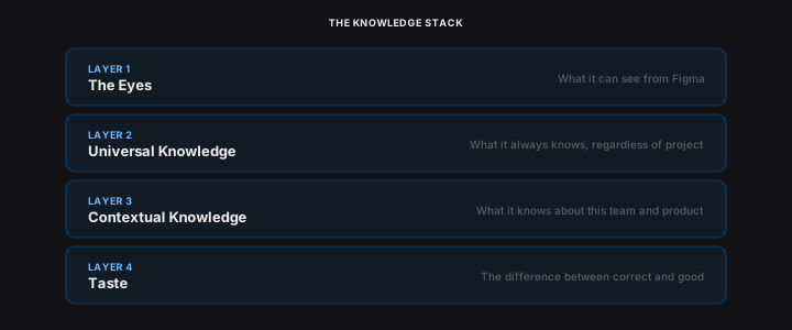
Layer 1 — The Eyes. What it can see from Figma. Selection, node tree, component structure, visual relationships. Already built.
Layer 2 — Universal Knowledge. What it always knows regardless of project. Visual design principles, UX laws, interaction patterns, accessibility fundamentals, content rules, flow and narrative. Baked into the system prompt and tools.
Layer 3 — Contextual Knowledge. What it knows about this team and product. Design system, brand voice, principles, product context.
Layer 4 — Taste. The hardest layer. The difference between correct and good. Opinionated. Willing to push back. Distinguishes personal preference from principled critique.
The second document was a character definition — the kind of designer I'd want reviewing my own work. Direct. Downstream-aware. Never a yes-and machine. Twelve core opinions about what makes a product designer good — from "understand what the system gives you for free before you break it" to "go back to first principles before you go anywhere near the canvas." On every interaction, the copilot runs a reasoning sequence — See, Situate, Interpret, Evaluate, Respond — and decides whether to question, observe, or give feedback based on what's most useful.
A linter tells you something is wrong. A thinking partner tells you whether it's worth doing right. That's the layer most tools don't have — and the layer the knowledge stack exists to make possible.
What It Sees
The custom GPT could only see screenshots. The plugin sees two representations of every selected node, and the combination is what makes it genuinely useful.
The node tree gives precision. Auto-layout direction, spacing values, padding, hierarchy depth, token bindings, component usage, layer names. This is how it catches "this button uses 14pt instead of the body token" or "there's a DSInfoBanner component that does exactly this."
A rendered screenshot gives intuition. Visual balance, crowding, hierarchy as a human perceives it. Structure alone might say "the spacing is correct" while missing that the screen feels cramped.
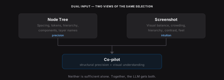
Neither is sufficient alone. Together, the LLM gets structural precision and visual understanding in the same request.
And it's not limited to what's selected. The plugin has awareness of the entire design file — every page, every frame, every component. Select a button on one screen and ask how it compares to the same pattern three pages over, and it knows. The custom GPT could only see what you showed it. The co-pilot sees the whole document.
A tool that only sees what you show it gives advice about screens in general. A tool that sees the whole file can tell you how this screen fits the rest of the product.
What It Knows vs How It Thinks
The system prompt defines how it thinks. Character, reasoning model, question logic, seniority calibration — a full personality embedded in every request.
Tools define what it knows. Knowledge domains exposed as callable functions. The model invokes them when relevant, not every time. This means the knowledge base scales without bloating the context.
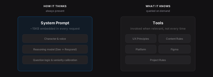
Five knowledge domains, queried on demand:
- UX principles — Hick's, Fitts's, Miller's, Jakob's, Tesler's, aesthetic-usability. As practical lenses, not academic references.
- Content design rules — the same codified ruleset from the content governance work.
- Platform conventions — iOS, Android, cross-platform. Navigation patterns, system behaviours, standard controls.
- Figma conventions — naming, component architecture, auto-layout, variables. The technical knowledge a principal Figma user carries.
- Project rules — team-specific conventions, brand voice, terminology. Configurable per-project.
The builder agent in SystemIQ uses the same knowledge tools. Same sources, two delivery mechanisms.
Knowledge crammed into every prompt degrades at scale. Knowledge queried on demand compounds. The base can grow without retraining — which means every team can add its own conventions, and the model just knows.
The risk is homogeny — when every designer, PM, and cross-functional partner pulls from the same knowledge base, that base's opinions quietly become everyone's. The mitigation: the knowledge base is owned and iteratively refined by humans who can push back on it, and the designer always has final say on the work itself. Centralisation isn't doctrine; it's a baseline that everyone can lift from.
Teaching It to Converse
The architecture was right. The conversation quality wasn't. Getting the LLM to behave like a thinking partner took eight rounds of prompt iteration. Vague questions triggered full audits — seven observations covering every element on screen. A senior designer would ask clarifying questions first.
So I added question logic. The LLM asked questions and gave feedback in the same message. I added a hard stop. The questions appeared, but as generic templates — "What stage is this at?" Intake questions for an audit, not questions that help a designer think. Round by round: questions must come from the design, not a template. Ban process intake questions. Read the designer's answers as a prioritisation signal. Go deep, not wide. Principle citations as inline badges, not textbook name-dropping.
Same screen. Same question. Before and after eight rounds of prompt tuning:

“Before: "what do you think of this view?"”
“After: "what do you think of this view?"”
The before version produced 22 bullet points covering every element on screen — missing states, loading spinners, colour contrast, touch targets. Generic observations applicable to almost any screen. It name-dropped the Von Restorff Effect. It suggested adding haptic feedback. None of it was wrong. But none of it identified the actual problem with the design.
The after version asked three questions and within two turns had identified the core issue: the screen frames a security feature as a limitation. "Select your bank" sets an expectation of choice, then the info card contradicts it. The fix isn't a missing loading state — it's reframing the mental model entirely. That's the difference between an auditor and a thinking partner.
Quiet Adoption
The tool wasn't mandated. It was announced, made available, left to find its own audience.
Adoption was fast — mostly because the content governance plugin had primed the team. The ruleset was the same; the plugin was just more intelligent, assessing the full canvas context rather than text in isolation. Designers quietly started opening it alongside their work. It replaced the screenshot-to-ChatGPT habit most of them already had.
Async feedback in Slack and Figma comments started happening more. People were unstuck. Conversations that used to wait for crit now surfaced in-flow. The pace of work shifted organically — incrementally, in a way you didn't really notice until you did.
A few PMs working on side missions asked for access. They were seeing craft elevation from the designers they worked with and wanted to level up their own work — copy experiments, simple UX calls they'd otherwise need a designer for. The tool found a cross-functional audience without me pushing it there.
Design labs improved. People stopped getting hung up on low-level things that didn't matter. That wasn't because there weren't things to discuss — it was because the tool had already handled the pattern-matching, and designers arrived with sharper questions.
I can't say everyone used it, or that every designer got dramatically better. What I can say, from direct observation: it changed workflows, made people move quickly, and made conversations sharper. That's the honest evidence. The kind you see in the room, not on a dashboard.
Everyone a Level Above
The principle underneath all of this: it makes everyone a level above where they actually are.
Juniors get coaching without relying on senior availability. Many teams, even large design teams, don't hire juniors because they can't afford the coaching time. This is that coach. Mid-levels gain confidence — they stop second-guessing, make decisions backed by principles, move faster. Seniors catch blind spots they hadn't considered, not fundamental ones.
And then there are the people who aren't product designers at all. PMs, engineers, marketers with editor seats doing "product designy things" out of necessity. Giving these people a co-pilot is like giving a designer access to Claude Code. Genuine superpowers, if it works well.
It's not a gatekeeper. The designer has final say, always. The moment a tool like this feels like a gatekeeper, people stop using it. It's a thinking partner grounded in the product they're building — the design system, the content rules, the UX principles, the platform conventions. Not just a screenshot and a prayer.
It raises the floor so the ceiling is the only thing left to worry about.
